Yesmom
Sensitive fertility and pregnancy tracking shifted from dashboards and streaks to calm guidance users could trust.
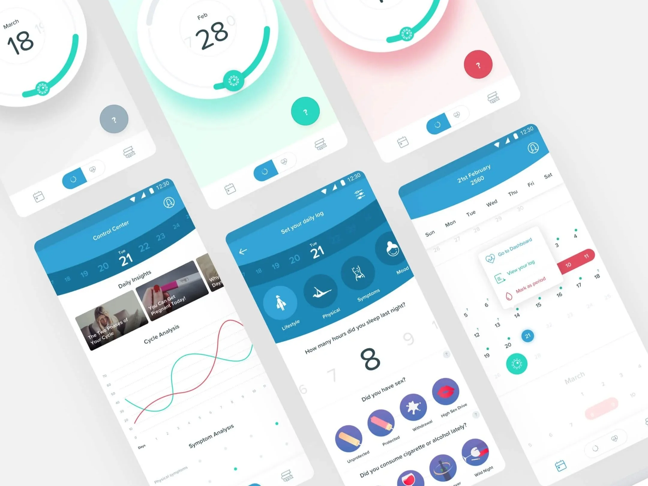
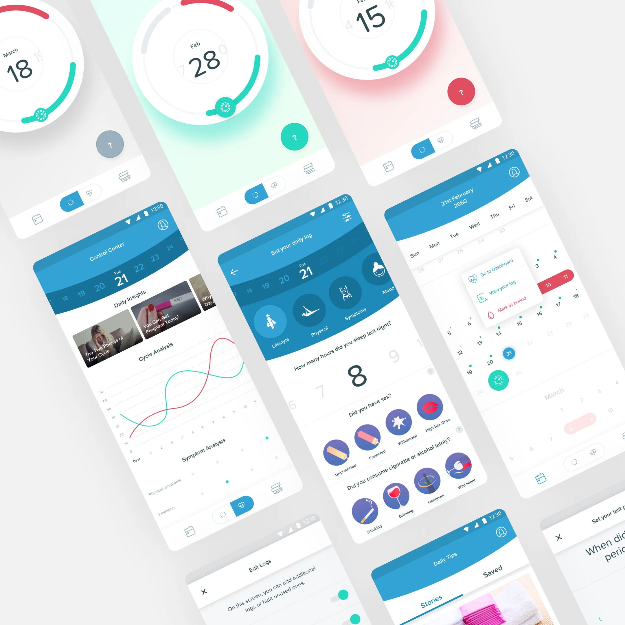
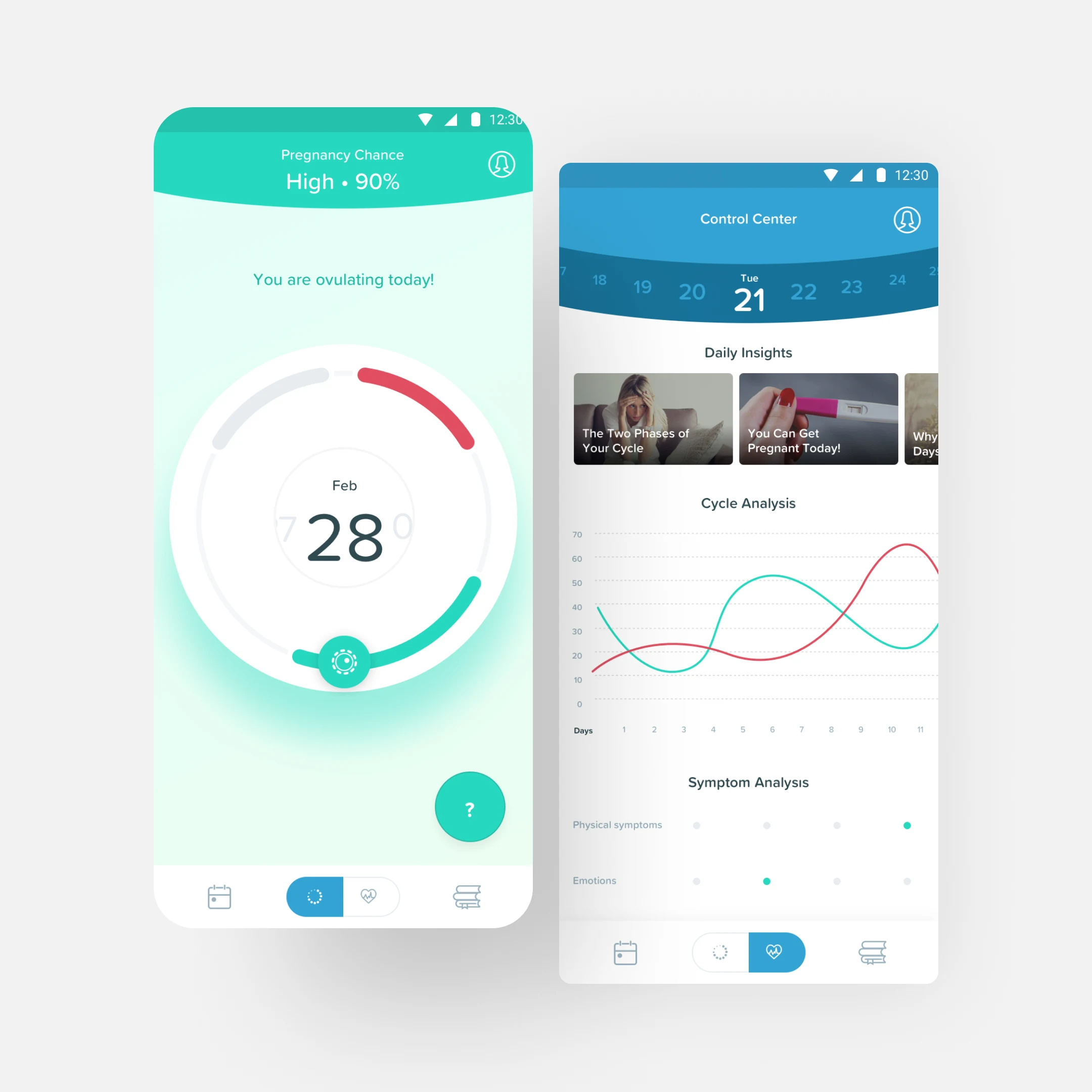
Yesmom is a fertility and pregnancy tracking companion. The brief wasn’t ambitious in feature count; it was ambitious in tone. Most health apps overwhelmed users with numbers, notifications, and gamified streaks. The goal was a product that supported, informed, and reassured without ever pressuring.
Context
Designing for sensitive health data means balancing clinical accuracy with emotional intelligence. The app had to handle private information, follow medical guidance, and remain trustworthy across very different life moments: trying to conceive, early pregnancy, loss, recovery.
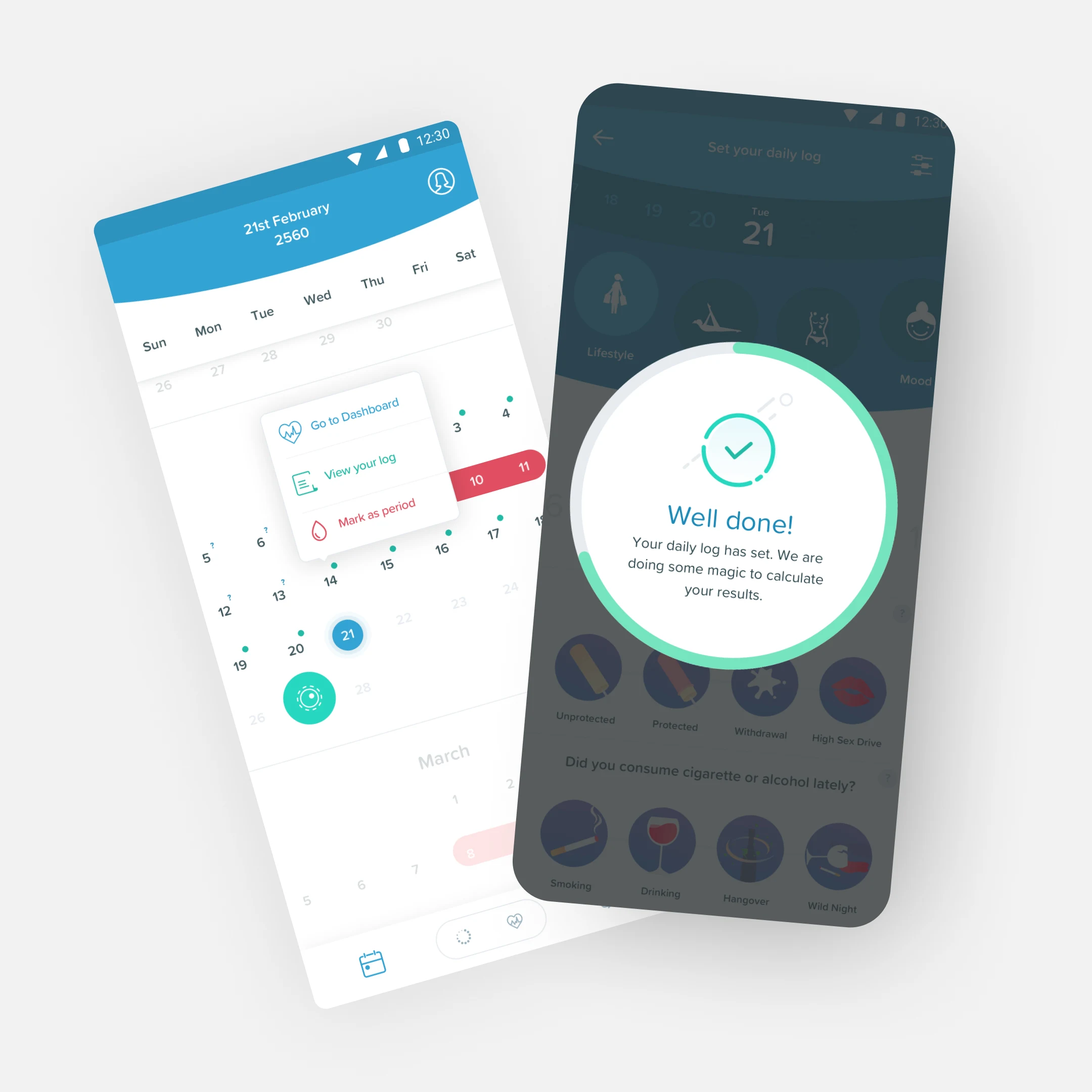
What I designed
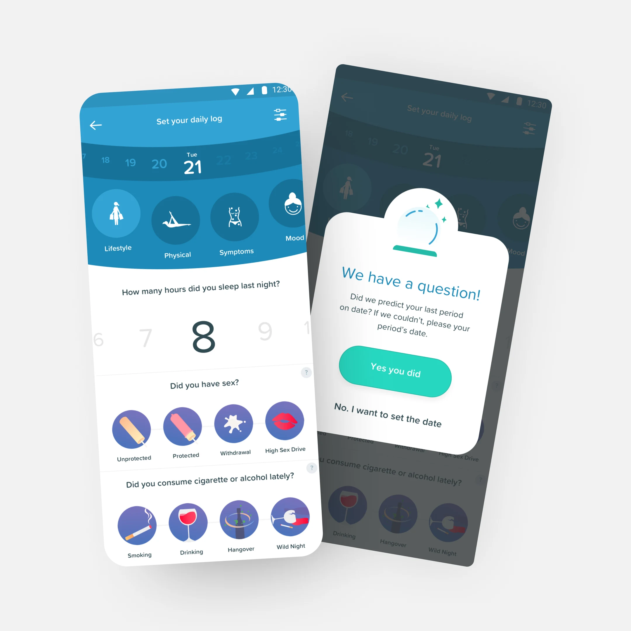
The interaction model and the daily rhythm. Research with users in active fertility and pregnancy phases showed that visual tone mattered as much as flow. Engagement went up when the interface felt calm and predictable. Patterns followed: gentle transitions, language that informed without prescribing, screens that gave enough information to guide and never enough to overwhelm.
The trade-off
Conventional engagement design (daily streaks, progress badges, push notifications nudging the user to log) would have driven retention metrics up. In a fertility context, those mechanics can be actively painful: a streak break after a loss, a notification on the wrong day. We chose the softer system: optional reminders, no streaks, no shame in skipping. Slower curves in exchange for a product users could keep open during difficult chapters.
What it changed
Launched as a trusted companion app. Users reported stronger emotional connection compared to typical health apps and used it as part of an actual routine rather than abandoning it after the first month. The design proved that precision and empathy are not a trade-off; both ship together when the product is opinionated about how it asks for trust.
Role
Senior Product Designer. Worked closely with content and clinical partners to align guidance with user behaviour.